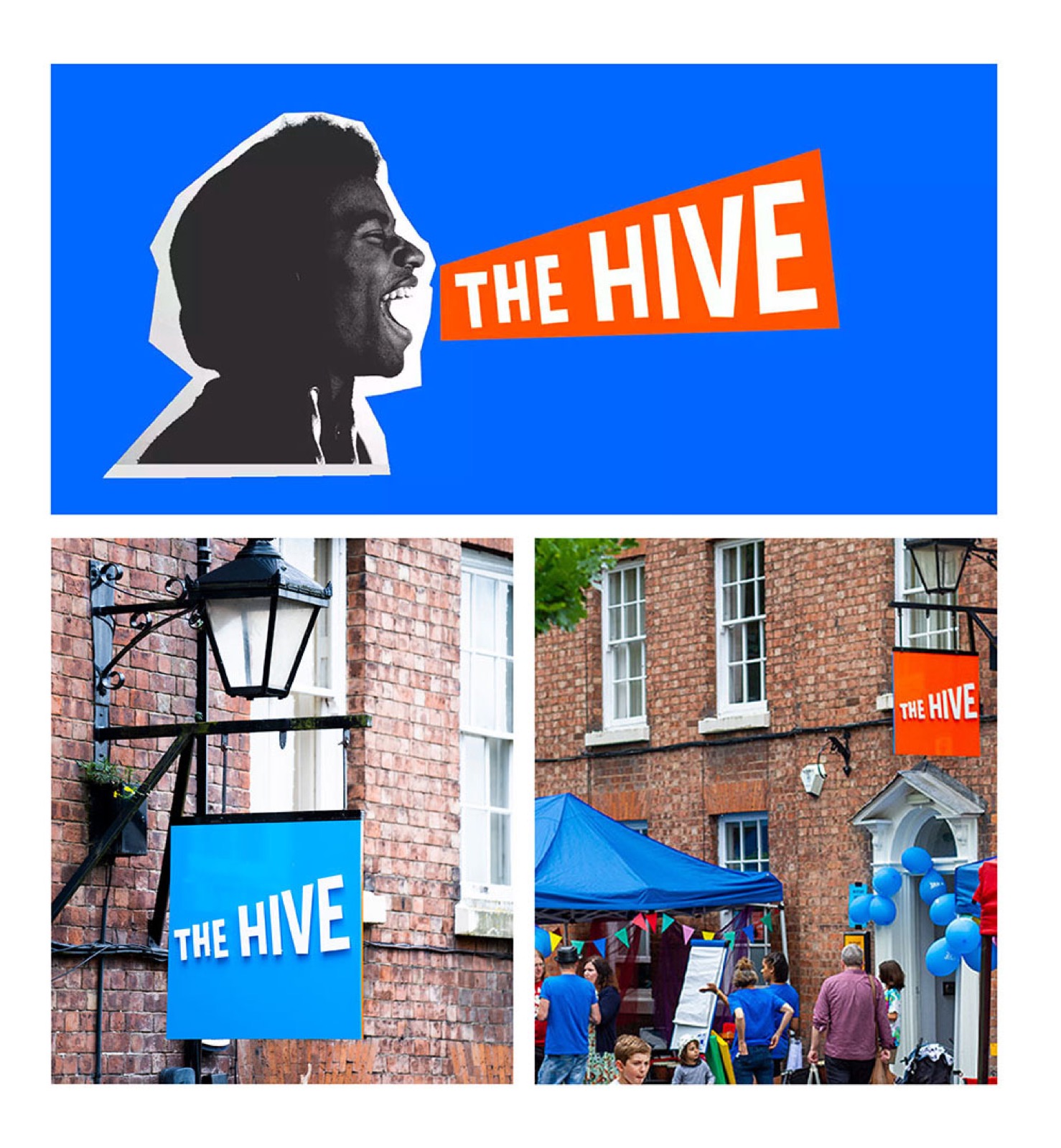
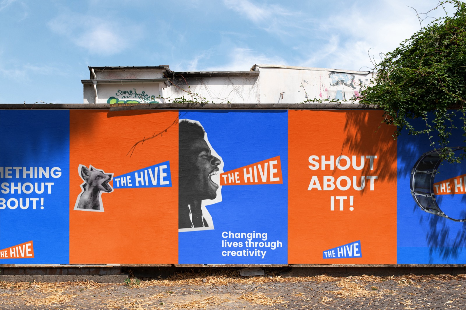
Charity
A charity rebrand that shouts.
The Hive came to us with a perception problem, people didn't understand who they were or what they did. They needed an identity to help them shout louder about their amazing work.
Challenge
It's a tough job to be a brand that's both modern and approachable to everyone. The Hive's biggest challenge was being understood, with a large team, a board of trustees, patron Charlie Adlard, the artists working within the space, and the young people who access it, a lot of personality to represent.
Our approach
We undertook the project with flexibility in mind, putting the client's personality at the heart of everything. We worked in groups with all of The Hive's demographics to capture its personality, building a brand that represents its primary audience of children and young people first, while staying flexible enough not to isolate other users.

Outcome
A vibrant, diverse identity The Hive could shout about, and a tenfold rise in donations after the rebrand.
increase in donations, attributed to the new brand
The new brand has contributed to a ten-fold increase in donations.Katie Jennings, CEO, The Hive